Catching a Reader’s Eye with Your Self-Published Book
Biff Barnes
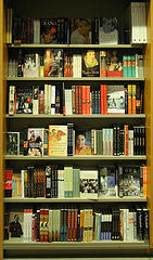
If your self-published book is going to be a commercial success, one of the things it needs to be is eye-catching.
That begins with a great cover. Chip Kidd, of Alfred A. Knopf, who designed the iconic cover for Jurassic Park among other bestsellers, explained the goal of a book cover in a recent TED Talk. He said, “I want you to look at the author’s book and say, ‘Wow! I need to read that.’”
 Courtesy of hobvias sudoneighm under Creative Commons“It’s a billboard,” said Peter Mendelsund, Kid’s colleague at Knopf who designed the cover for the Stieg Larsson novel, The Girl With the Dragon Tattoo and its two sequels. “You hope yours shouts the loudest or entices the most intriguing way."
Joseph Kunz on his Kunz on Publishing Blog advises, “Having the appropriate graphics, images, photos, illustrations, colors, fonts, etc., are essential if you expect to get noticed by book buyers.” A self-publisher should ask himself, says Kunz, “What needs to be on your book’s cover that will draw in, or attract, a reader and a buyer? Are the graphics, colors, and fonts appropriate to the book’s subject matter?”
How your cover looks online grows more important daily as more and more books are sold online. Guy Kawasaki, in his recent book APE: How to Publish a Book, explains, “Your cover must stand out in a sea of postage-stamp-size covers on websites. A cover that looks great in a six-by-nine-inch printed format won’t necessarily work on the Amazon, Apple, Barnes & Noble, and Kobo website.”
Kristen Eckstein in Five Secrets to a Killer eBook Cover on The Future of Ink Blog points out something important that self-publishers sometimes overlook. “More important than color or pictures is that your title is clear and easy to read.”
Making sure that title is eye-catching title as well as readable is essential. Author’s often struggle with that. Would you read a novel titled Trimalchio in West Egg? That’s what F. Scott Fitzgerald titled his third novel until his editor Maxwell Perkins convinced him The Great Gatsby might work better.
A good title might do many different things:
- Grab a reader’s attention
- Make a promise
- Create anticipation, intrigue or an emotional response
- Identify a need
- Simply state the contents
As Michael Hyatt, Chairman of Thomas Nelson Publishers explains, a book’s title is “…like a newspaper headline: If prospective readers are intrigued, they keep reading. If they aren’t, they move on to the next book…”
A recent Smashwords study offered some insight on the length of a good title. CEO Mark Coker reported that, “We looked at character count, which indicated slight advantage for shorter titles, and then we looked at word count, where the advantage appeared to be more pronounced.” The average word count for the top 100 Smashwords titles was 4.2 words. Cocker speculated on why shorter is better, “Maybe shorter titles catch the reader's eye and attention more effectively… Or maybe some retailers' inability to list super-long book titles on the merchandising page reduces effectiveness?”
The appearance of your cover or title may not have much to do with your book’s content, but they will have a lot to do with its potential sales.