Publishing a Book: People Will Judge It By Its Cover
Nan Barnes
How do you make your book stand out from the thousands of others being published each year?
It all starts with your cover.
Chip Kidd, a top book cover designer at Alfred A. Knopf, who brought us the distinctive book cover of Jurassic Park, and one of the best-designed, all-around-best books on my reading shelf right now, Haruki Murakami’s IQ84, explains: “The book designer’s responsibility is three-fold to the reader, to the publisher, and most of all to the author. I want you to look at the author’s book and say, ‘Wow! I need to read that.’”
“It’s a billboard,” said Peter Mendelsund, Kid’s colleague at Knopf who designed the cover for the Stieg Larsson novel, The Girl With the Dragon Tattoo and its two sequels. “You hope yours shouts the loudest or entices the most intriguing way."
A bad cover shouts out in a different way. “The first outward sign that your book is self-published is a crappy cover design.” said Guy Kawasaki, APE: How to Publish a Book.
Let’s look at some excellent covers and some thoughts on what makes them effective.
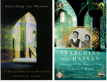 The human face may be the most compelling idea a book cover can convey. Compare the covers of Terence Ward’s Searching for Hassan, a story of an American family searching for a long-lost friend in Iran. In the first, hardcover version, the Persian architecture suggests the book is all about the setting. Redone for softcover, the colors are brighter, the Persian element recedes to the background, and a period photo of the people is front and center. It's better, isn’t it?
Should your book cover be ‘authentic’, or slick? Compare and contrast these books. The Way We Never Were ironically depicts the family with a family photo that is so perfect it would never have been taken in real life. It is a crisp, high definition, high quality image, and the cover shouts ‘good design”.
 In 5 Finger Discount, the picture of the brazen urchin on the streets of Jersey City is undoubtedly real. It is damaged and faded, like so many of our family treasures. And it speaks volumes: I’ll bet this family didn’t pose for studio sessions! The child’s cheeky grin aptly sets the tone for this humorous family history.
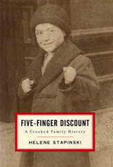 Which is better? That’s a trick question. They are both effective covers, with entirely different messages about their subjects. Know that you can use a beloved, flawed image, especially if it is the very one that tells the truth. One the other hand, sharp photography can be a pleasure to behold – when it accurately represents your book.